Snackos
Snackos is a snack ordering app designed for movie theaters. Snackos targets all kinds of users especially those who would like to have healthy snacks.


The User Need and the UX Response
In movie theaters, customers must wait in line to get food, including elderly and busy employees. Additionally, there were not many options of customizing snacks to individual dietary needs


Problem
Solution
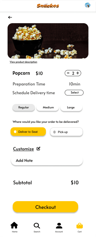
I wanted to create an app so that the customers can order snacks easily. They have a feature to schedule their snacks according to their convenience. They can customize their snacks using the customize option in the app according to their health restrictions, skip the foods which they are allergic to, get a detailed product description and the ingredients used in the food. They can also get a chance to try the unique food combinations.
User Research
I performed interviews and developed empathy maps to gain insights into the users I am designing for, as well as to comprehend their requirements and concerns better. A primary user group identified through research was working professionals who wanted to have healthy snacks
This user group confirmed initial assumptions about customers, but research also revealed that time was not the only factor limiting users from cooking at home. Other user problems included obligations, interests, or challenges that make it difficult to spend quality time with their loved ones.
The lack of diverse snack options that cater to individual dietary needs can be a problem for moviegoers with specific dietary restrictions or preferences. Through this app users can see the menu which includes a wider variety of snack options, including vegetarian, vegan, gluten-free, and healthier choices, to meet the diverse dietary needs and preferences of customers.
Customers, including elderly individuals, often experience long wait times when purchasing food at movie theaters, which can lead to frustration and delays. Snackos is a more efficient and faster food ordering and delivery system to reduce wait times and improve the overall customer experience.
Pain Points
The lack of diverse snack options that cater to individual dietary needs can be a problem for moviegoers with specific dietary restrictions or preferences. Through this app users can see the menu which includes a wider variety of snack options, including vegetarian, vegan, gluten-free, and healthier choices, to meet the diverse dietary needs and preferences of customers.
Customers, including elderly individuals, often experience long wait times when purchasing food at movie theaters, which can lead to frustration and delays. Snackos is a more efficient and faster food ordering and delivery system to reduce wait times and improve the overall customer experience.
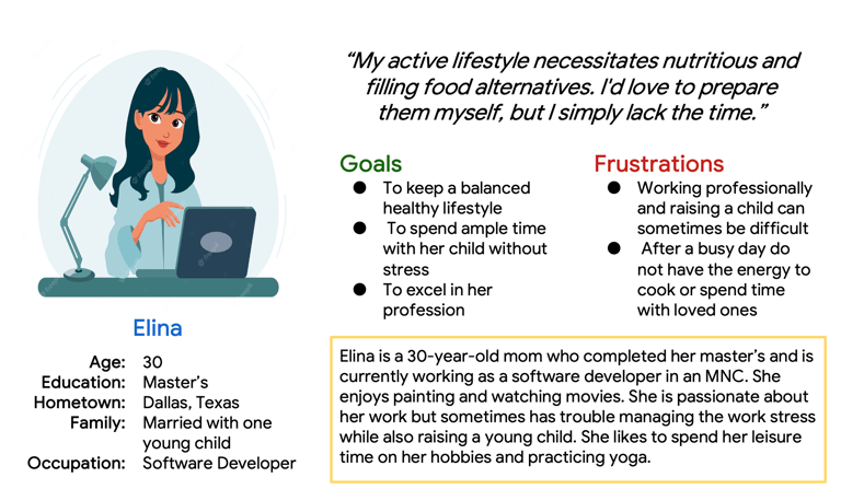
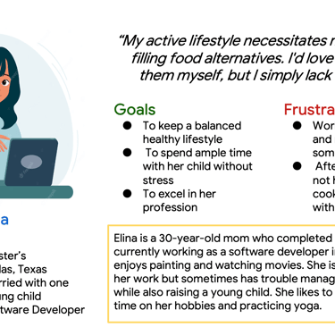
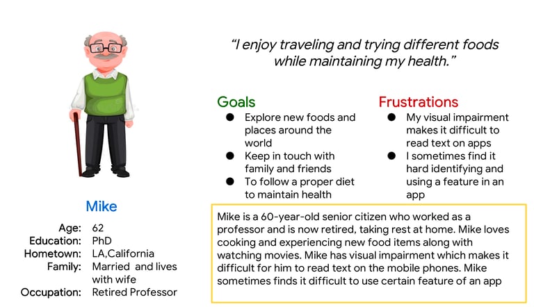
Personas
Personas assist in maintaining attention on the target consumers throughout the design process. They provide designers a concrete idea of the requirements, goals, behaviors, and preferences of the users, allowing to develop solutions that are appealing to real users.
These Personas are built on a foundation of user research, data, and insights gathered from various sources.
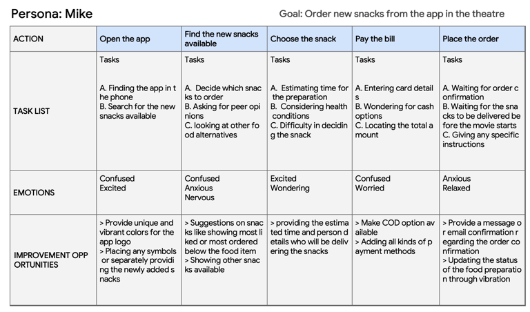
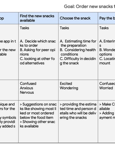
User Journey
Competitive Audits
In the creation of the snack ordering app for movie theaters, I applied a comprehensive UX design approach, incorporating a range of essential methodologies and tools to ensure the project's success. I meticulously crafted user journey maps, allowing me to visualize and empathize with the entire snack ordering process, from patrons entering the theater to enjoying their treats during the movie.
To establish clear project objectives and validate design decisions, I formulated precise goal statements and hypothesis statements, serving as our project's guiding compass. These statements helped us remain aligned with user needs and expectations
In order to develop a deep understanding of the competitive landscape, I conducted thorough competitive audits, examining similar services in the industry. This not only provided valuable insights into best practices but also helped us identify opportunities for differentiation and innovation within the market.
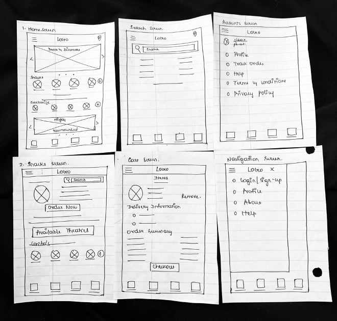
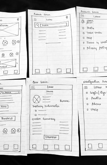
Sketches
I began the design process with low-fidelity sketches and wireframes to accelerate decision-making through visualization without losing time. My sketches were based on the initial user interviews, the business goal, and the heuristic evaluation. They each pointed to the fact that there were too many distractions in the flow. We came back to the sketches throughout the entire design process to make sure that we don’t lose sight of our primary goals and ideas.
It was made sure that the components that made for the digital wireframes would be well-suited to solve user pain points by taking the time to create iterations of each app screen on paper. For the home screen, I prioritized a quick and easy ordering process to help users save time.
Digital Wireframes
As the initial design phase continued, I made sure to base screen designs on feedback and findings from the user research.
In addition to making the app compatible with assistive technology, easy navigation was a major customer need that had to be taken into account in the design.
Using Figma, I translated my first sketches into low-fidelity wireframes. At this stage, the wireframes were defined enough for some user testing. Based on the tests, I’ve made a few alternations and moved on to creating high-fidelity prototypes.
The designs were also created for the website screens for the same product. For website designs Adobe XD was used.
Usability Testing for mobile screens
I conducted two rounds of usability studies. Findings from the first study helped guide the designs from wireframes to mockups. The second study used a high-fidelity prototype and revealed what aspects of the mockups needed refining.
Round 1 findings
Finding track order feature is confusing
Back buttons for few screens are not functioning properly
Adding search option in homepage would be easy to find snacks
Round 2 findings
The add button for the snacks in the home screen is not functioning
The back button for the payment option is not working properly.
Not able to understand if the user is able to signed in or not.
Mockups for mobile screens
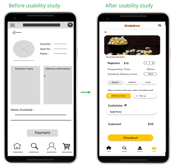
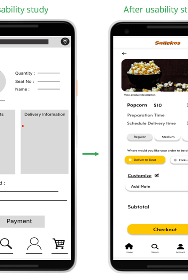
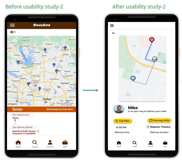
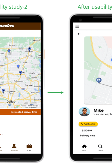
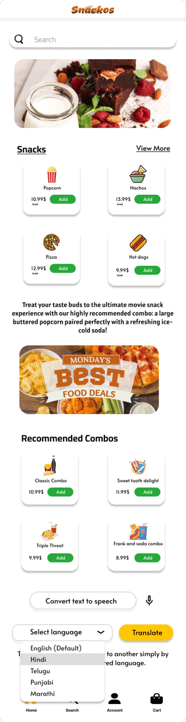
Early designs allowed for some customization, but after the usability studies, I have restructured the screen by adjusting the texts and buttons to create negative space as before usability study the screen seemed cluttered.
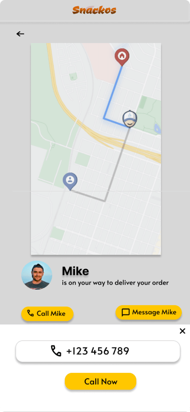
The second usability study revealed that the track order screen is not visually appealing and it needs fixtures, so i remade the design and added call and message options
Usability Testing for website screens
Two rounds of usability tests were conducted for the website screens using the low fidelity prototypes and high fidelity prototypes. Based on the test, changes were made to the screens
Round 1 findings
Search button is not present.
After customizing and adding the seasonings they are not being reflected on the pages.
Round 2 findings
Font is too big.
Health information about the snack is not mentioned.
Mockups for mobile screens
Early designs allowed for some customization, but after the usability studies, I have restructured the screen by adjusting the texts and buttons to create negative space as before usability study the screen seemed cluttered.
The second usability study revealed that the track order screen is not visually appealing and it needs fixtures, so i remade the design and added call and message options
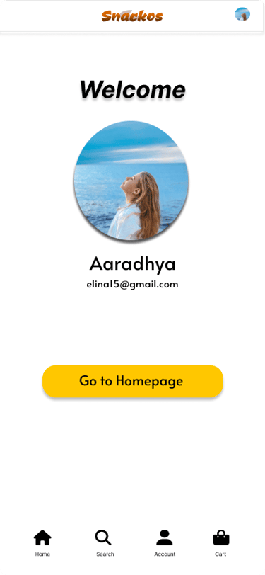
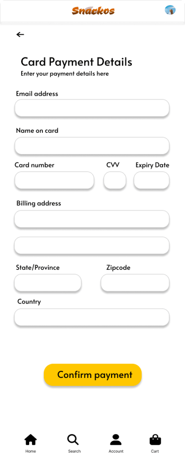
High Fidelity Wireframes & Prototype
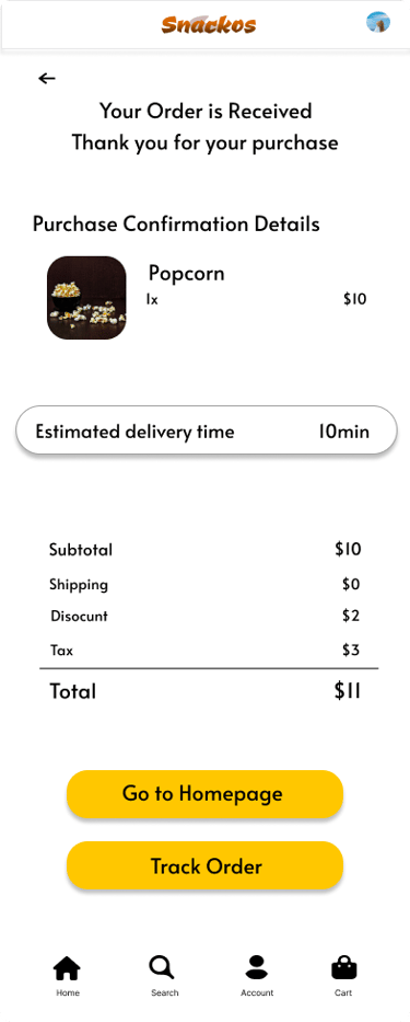
The final high-fidelity prototype presented cleaner user flows for ordering snacks and checkout. It also met user needs for a pickup or delivery option as well as more customization.
Prototype Link: https://www.figma.com/proto/D580Pl6Bz0l2B9WahXouMo/Snacko's-Mobile-HI-Fi-Wireframes?node-id=810-3147&t=f7eK7jET4wcdBUwH-1&scaling=min-zoom&content-scaling=fixed&page-id=802%3A7168&starting-point-node-id=810%3A3147
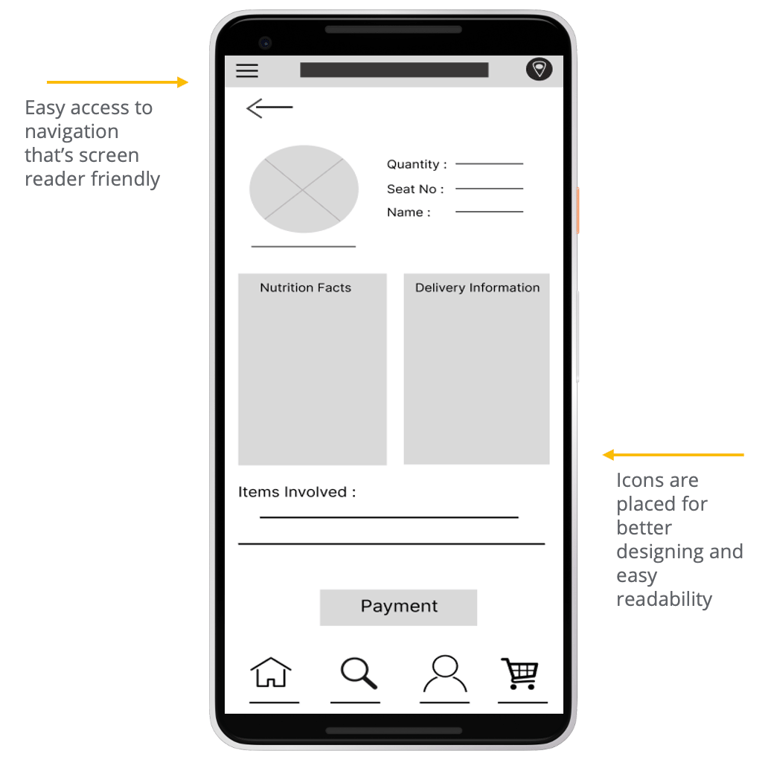
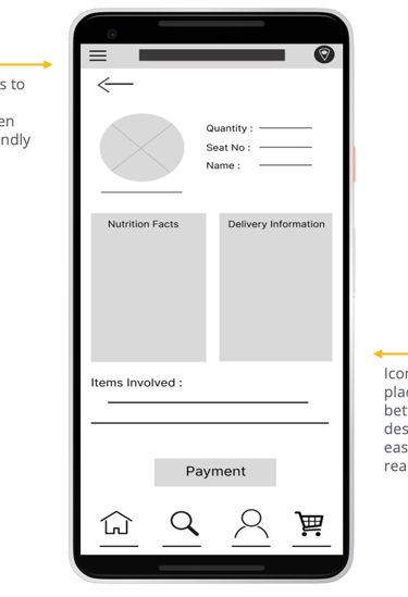
Accessibility Considerations
Provided access to users who are vision impaired through adding alternative text to images for screen readers.
Used icons to help make navigation easier.
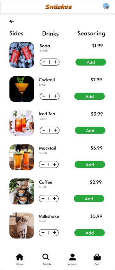
Used detailed imagery for pizzas and toppings to help all users better understand the designs.