Nuvioo CRM- Profile Dashboard Design
As part of a CRM design challenge assessment for Nuvioo, I crafted a modular profile view that transforms customer data into actionable insights. The goal was to equip support staff and account managers with the clarity and tools to respond with speed and precision.


Project Overview
Client : Nuvioo
Project Type: UX/UI Design Challenge
Role: UX/UI Designer, UX Researcher
Duration: 1 Week
Overall: 1 weekDiscovery and Research: 3 days
Design and Testing: 3 Days
Tools Used: Figma
The Challenge
Nuvioo, a restaurant-focused CRM platform, needed a refined customer profile dashboard that brought together multiple data points—contact info, platform usage, and support history—into a single streamlined interface. The solution needed to be intuitive, insight-driven, and easy for internal teams to navigate and act upon.
Design Decisions: What, Why & How

User Research
Due to the limited timeframe, direct user interviews or stakeholder sessions weren’t possible. Instead, I drew insights from common patterns in CRM tools and inferred needs based on key user roles:
Customer Success Managers – Prepare for client check-ins, monitor account status, and leave updates.
Support Technicians – Resolve technical issues quickly, reference logs, and follow up on service tickets.
These assumed roles informed the design priorities, user flows, and content hierarchy.
The goal of this project was to reimagine the CRM profile experience for Nuvioo—focusing on centralization, clarity, and speed. The redesigned interface aims to make user data easy to access, interpret, and act on, enabling teams to serve clients more efficiently.
Pain Points
Scattered Information – Customer profiles span multiple systems or tabs.
Complex Navigation – Too many steps to access commonly used features.
Hard-to-Read Logs – Long activity histories lack structure or clarity.
No Quick Actions – Core tasks like logging notes or contacting users aren't accessible from the profile view.
These challenges created unnecessary friction for users, particularly in time-sensitive support environments. The lack of unified visibility into a customer's journey often led to delays, missed context, and inefficient internal handoffs between team members.
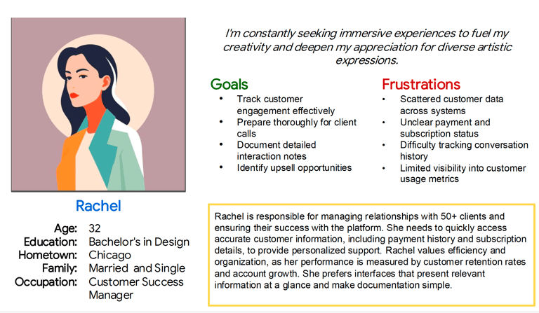
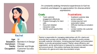
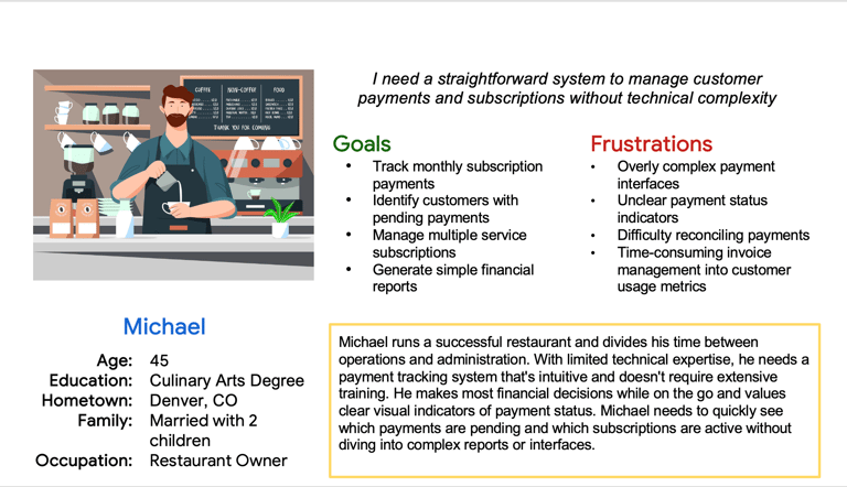
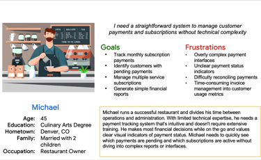
Personas
Personas helped me stay focused on the core user needs throughout the design process. By imagining the day-to-day workflows and frustrations of two key user roles- Rachel and Michael. could more effectively prioritize features that offer real, task-level value.
Rachel’s need for structured data and fast meeting prep influenced how I designed the contact view and activity summaries. Meanwhile, Jason’s need for detailed logs and issue history directly shaped the timeline layout and visibility of customer interactions.
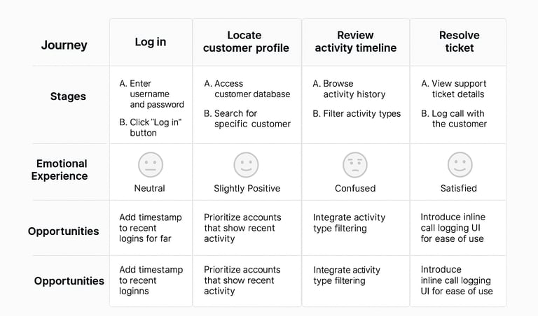
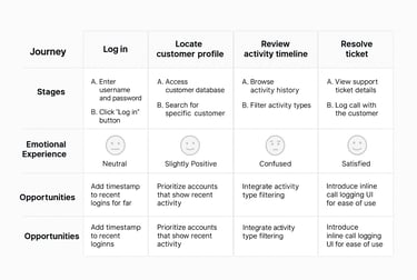
User Journey
Competitive Audits
Mapping the user journey provided a visual understanding of where users might face confusion or delays when interacting with a CRM system. Rachel's journey helped identify touchpoints where context-switching could be minimized—like showing tags and company info up front. Jason’s flow emphasized the importance of quick filtering, clarity in chronological actions, and a visible log trail. These insights influenced layout decisions like sticky headers, visible login timestamps, and how logs are structured in timeline order.
To establish clear project objectives and validate design decisions, I formulated precise goal statements and hypothesis statements, serving as our project's guiding compass. These statements helped us remain aligned with user needs and expectations
In order to develop a deep understanding of the competitive landscape, I conducted thorough competitive audits, examining similar services in the industry. This not only provided valuable insights into best practices but also helped us identify opportunities for differentiation and innovation within the market.
Design Direction
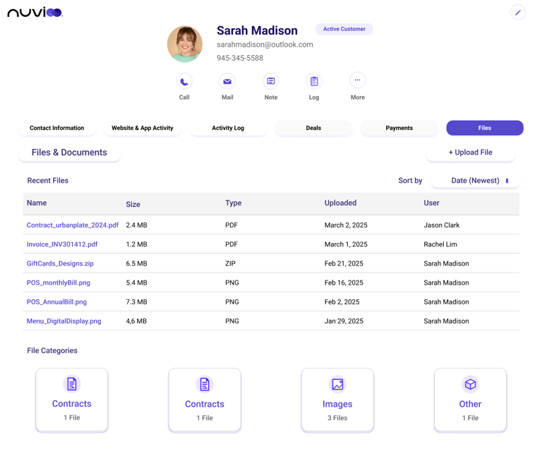
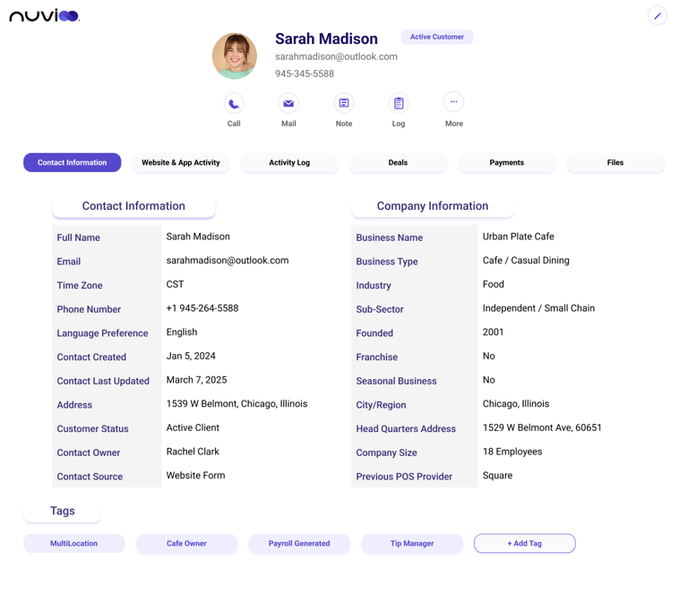
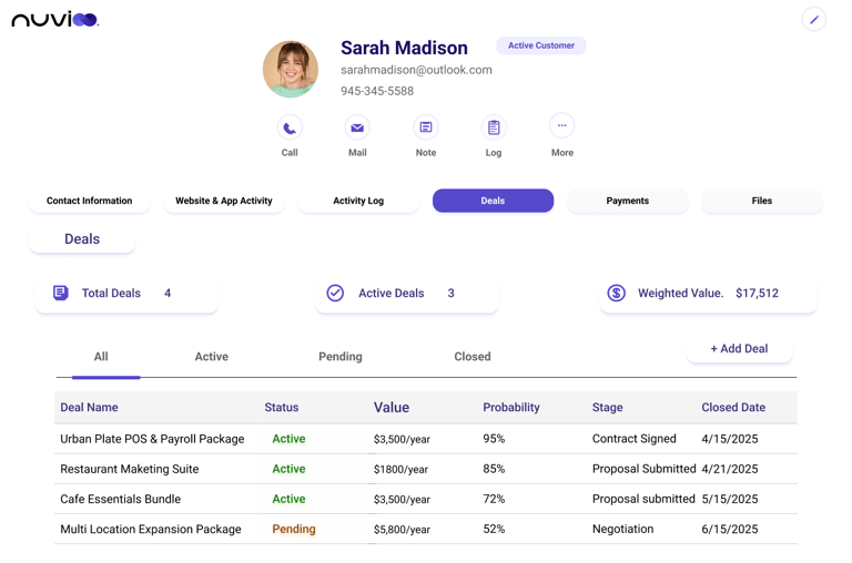
The visual and functional strategy was to offer clarity through layout, and control through contextual action. I took a content-first approach, surfacing only the most relevant information in each section while hiding secondary details in collapsible cards. The decision to avoid traditional dense table views and instead use a modular card structure was based on the need for scanability. By grouping tasks and streamlining navigation, I created an interface that aligns more closely with how real users think and act in daily workflows. Rather than replicating conventional CRM models, I aimed to streamline user workflows while keeping key data instantly accessible. Nuvioo’s CRM profile view stands out by:
Simplifying Navigation: Intuitive tabs and card layouts reduce cognitive load.
Prioritizing Actionability: Frequent tasks like calling, logging notes, and emailing are one click away.
Visual Hierarchy: Key contact data, status, and engagement tags are presented upfront.
Context-Rich Interaction: Activities and logs are visually distinct and easy to follow.
These design principles improve task completion time and support clarity under pressure.
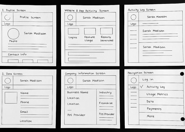
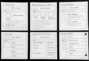
Sketches
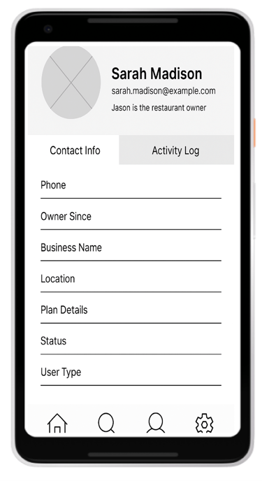
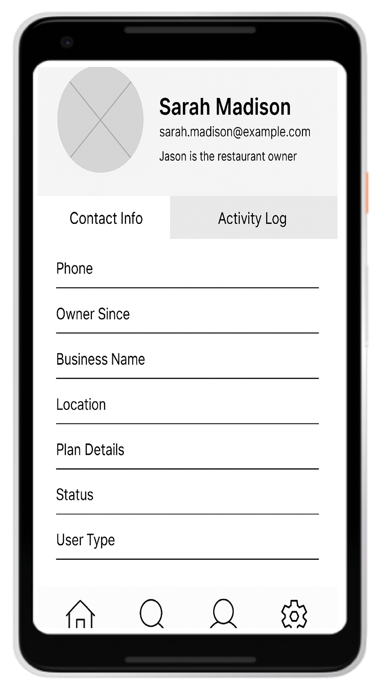
It started with paper wireframes to explore spatial relationships, section priorities, and key actions without overcommitting to visuals. These quick iterations allowed me to test ideas like having a sticky action bar and tabbed content views before moving into high-fidelity design. Sketching helped eliminate distractions and encouraged lean thinking, ensuring that only critical components made it into the digital phase. These sketches remained a constant point of reference as I transitioned into Figma. Initial sketches helped define spatial structure and feature grouping. Key ideas included:
Horizontal tabs for navigation
Sticky action bar with quick-access tools
Split sections for contact and company info
These served as a reference point throughout the design process to ensure alignment with the initial goals.
Digital Wireframes
The digital wireframes were where layout, structure, and hierarchy became concrete. I used Figma’s auto-layout features to build scalable wireframes and maintain consistent padding and spacing. Timeline entries were color-coded and grouped to improve readability. Modular cards helped separate content areas logically, such as personal contact info, company details, and user actions. These wireframes allowed for early feedback and gave me confidence in the information architecture before applying visuals. Digital wireframes were created in Figma and featured:
Scrollable activity timelines
A responsive two-column layout
Modular cards for consistent hierarchy
Auto-layout grids for scalable design
The wireframes set the foundation for layout decisions and early design feedback.
Usability Testing
Though time didn’t allow for formal usability sessions, I simulated task flows and walked through the screens as if I were both Rachel and Jason. These mock scenarios helped surface design issues like lack of contrast in timeline entries or excessive spacing in some layouts. By iterating based on these findings, I was able to fine-tune user paths and interactions to better match the needs of fast-paced customer support teams. Although no live testing was conducted, multiple rounds of self-review and mock user flows helped refine the design.
Key Refinements:
Combined logs into one timeline for easier browsing
Made last login data more prominent
Adjusted spacing for improved scanability
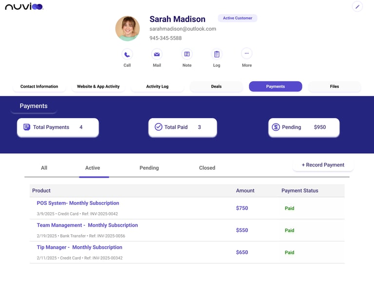
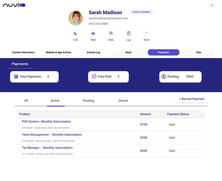
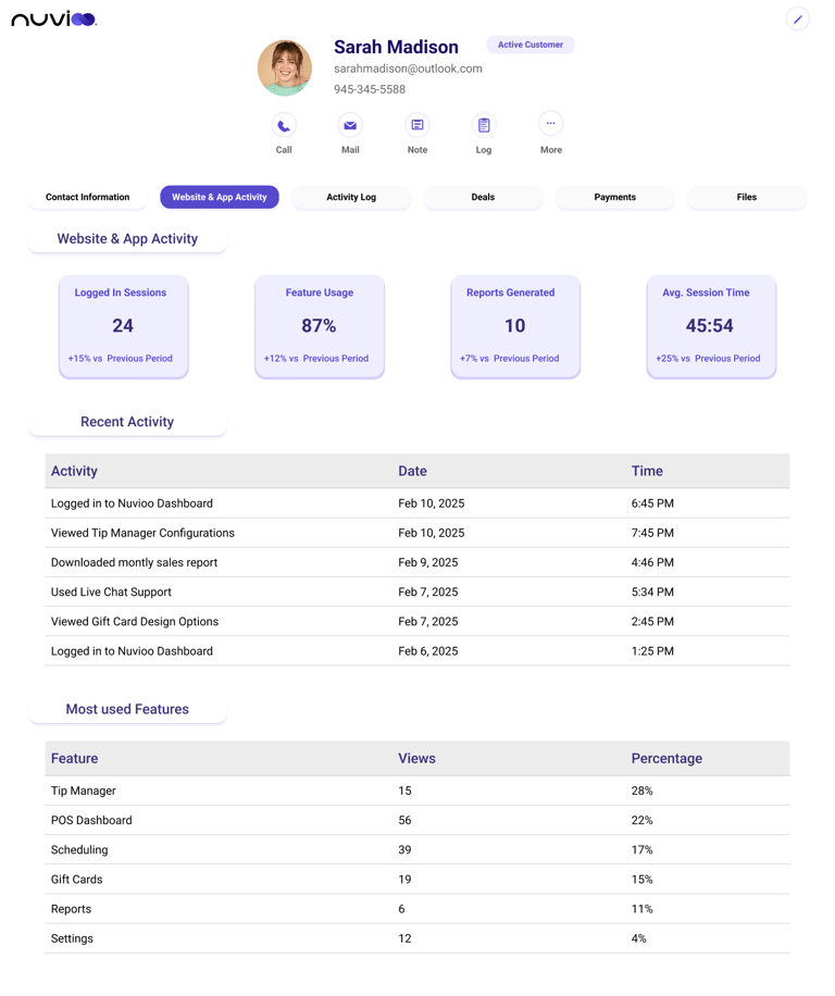
The final UI design brings together everything I learned during ideation, research, and iteration. It presents a focused, modular interface that minimizes clutter and highlights actionable content. Visual balance was achieved using consistent typography, spacing, and a calm but professional color palette. Special attention was given to interaction hierarchy—ensuring users can find what they need quickly, whether that’s a contact number, activity summary, or log entry. Final designs focus on A clean, calm interface for busy teams, Highlighting key interaction points (tags, activity, contact details), Quick-access action tools, Modular layout components for easy updates
Final UI Design
High Fidelity Wireframes & Prototype
The high-fidelity prototype was built using Figma’s component system and auto-layout to ensure responsive behavior and development-ready structure. Each screen was designed to reflect a realistic, working product—from tab switching to user status indicators. This prototype not only brings the vision to life but also serves as a strong base for future developer handoff or usability testing phases. Created in Figma using:
Auto-layout + spacing constraints
Consistent color system (primary, state-based, and neutral grays)
Accessible forms and CTA contras
Accessibility Considerations
Accessibility was considered from early layout planning through final visual detailing. I used meaningful alt text, consistent color contrast, and icon backups for all status indicators. Tab navigation and keyboard interaction were factored into layout spacing and interaction feedback. These choices ensure the CRM can be used effectively by a wider range of users, including those relying on assistive technologies.